
Company
Yirental
Role
Product designer / UX researcher
Timeline
8 Weeks (Dec.2019 - Jan.2020)
Roommate match is a feature which helps people to find compatible roommates easily and safely based on mutual criteria and similar social networking
Yirental is a digital platform that offers users rental and living solutions in the local community. The mission is to build the most-trusted, high-quality, and professional rental network based on social connections. Since 2017, Yirental has become the biggest rental platform for the Chinese hosts, students, and young professionals who dwell in North America. Currently, it has more than 100,000 registered users and 150,000 app downloads.
In the Beta version of the ‘seeking roommates’ feature, people could post a listing through our platform after filling out a form. Even though the Beta version was rough, we noticed there was nevertheless a considerable number of active posts related to seeking roommates.
Thus in this project, we decided to optimize the ‘seeking roommates’ experience on our platform in order to reach following goals:

In the Beta version, people could post a listing of seeking roommates after filling out this standard form.
Without wasting time weeding through tons of listings, Roommate Match will provide the user with numerous compatible roommate options based on mutual criteria and similar social networking.
Our initial exploration guided by these research objectives:
We sent out 35 questionnaires to users who posted listings to find a roommate on our platform to gather quantitative data. We received 32 responses.
We conducted follow-up interviews with 5 users who participated in the survey and interviewed 3 strangers on University Way near the UW.
To cover a broader sample size. I analyzed Quora posts, Reddit posts, and other articles online related to roommate finding tips.
I analyzed and tested market leaders including Craigslist, Facebook rental group, RoomieMatch and Roommates
Our survey indicated that there are three groups of users who posted listings to seek a roommate on our platform.


College student/Young professional who doesn’t have a strong local network


Tenant who has a lease contract and is trying to find a roommate to share the cost


Landlord who owns a house and is trying to find a tenant to share the cost.
Since our product’s core service is house rental, we wanted to encourage the tenant with a room and the landlord to post their listing in our house rental section instead of using “Roommate match”. I persuaded the team to focus on college students/young professionals who don't have a room yet to avoid distracting users from our core service. In addition, I believed we might encourage future profitability since this group of users will need rental services later.
To understand what the real experience of finding a roommate was like and what their challenges were, we conducted user interviews with 8 participants. We found that outside of friend groups, the existing experience finding roommates takes weeks or months. The process is filled with rental scams, guesswork, no-replies, and dead-ends, which ultimately leads to a long and frustrating experience.
People hesitate to trust strangers online and prefer to find someone sharing a similar background, community, and social context.
I usually start with the UW community and FB group. If I start talking with potential roommates, I also will check their facebook to see if we have any mutual friends.
Searching for roommates is a lengthy process that requires dozens of hours sifting through listings and rehashing the same details across different platforms.
There's no easy way to filter compatible roommates by location, dates, costs, and neighborhoods in FB group
People have privacy concerns in disclosing personal information, which leads to back and forth emails and messages
I won't post everything in my listing to avoid rental scams. But I have to introduce myself again and again to different people later.
People value rental harmony with roommates
I don't mind taking an extra half-hour to commute if I can live with a cool person.
Based on the survey and user interview, we found Facebook Groups and Craigslist are the most popular way to find roommates even though they are not specifically designed for roomie finding. Alternative solutions include 20+ apps and websites that categorize themselves as roommate focused, I decide to test out RoomieMatch and Roomates.com since they are leaders in the market.
After trying out these platforms by myself, I found two polarities among the market: Private and Public, Thoroughness and Expeditiousness.
Craigslist is a typical product that prioritizes Public and Expeditiousness. Everyone can post their listings quickly with unverified information. The trade-off is tons of rental scams or low-quality messages.
RoomieMatch is another extreme that prioritizes Privacy and Thoroughness. It asks you 79 questions before you get approval for the registration. Actual humans review all roommate profiles, which eliminated scams and red flags, but the process is tedious and slow.

So, where position our product on these coordinates?
Before making a decision, I went back and reviewed the mission of our product and the project's goals.

Yirental is a product aiming to build the most trusted, high-quality, and professional rental network based on social connections and the local community. Creating an exclusive vibe matches our product positioning, and we could leverage many other features (community, people and connection) to support it.

The original goal of optimizing the roommate finding experience was to boost user growth and potentially direct the traffic to profitable features. As a lightweight feature in the App, it's not reasonable to make it overly complicated, either considering user experience or business cost. Thus it makes sense to find a sweet spot between thoroughness and expeditiousness.
I presented this rationale to the team and we aligned on the goal of prioritizing privacy and finding a solution that landed midway between thoroughness and expeditiousness.

Based on all these insights from research, I refined three design principles as a reusable standard to measure our ideas and work for the rest of the project.

Create a community based on social networks to ease people’s concern/distrust of strangers and let them know people on our platform are seriously looking for a roommate

Help people skip the guesswork, filter out less useful information and find a compatible roomie quickly and easily.

Empower people to control their information visibility and fend off rental scams and spam
After brainstorming together, our team came up with a bunch of ideas that fit within our design challenge and design principles.
As a startup, we didn’t want to build up the something with no market demand. It's extremely important for us to make an informed decision while prioritizing features. To help the team better narrow down ideas, I broke them into themes to avoid choice paralysis.
.jpg)
After that, I helped the team to prioritize features based on impact/cost coordinates to find out our MVP.
In sum, we decided to leverage our current features (like Community and Friends) to design an enjoyable roommate matching experience.
.jpg)
After identifying features, we needed to decide what questions we should ask users to help them find matchable roommates. To address this challenge, I conducted a closed card sorting activity. I gave them 30 cards and asked them to put them into three categories: " Top three, "must-have," and "Nice to have" . Based on their feedback, we formed our question list.

Based on the question list coming from card sorting, I mapped out pages in a hierarchy to help the team understand the structure. This sitemap not only set the foundation for our design, but also helped us better communicate with Dev team and enabled new team members to ramp up quickly.

Describe your ideal home, Introduce yourself and help us learn your preference synchronously.
See your matches who shared similar backgrounds and fit for your preferred roommate behaviors.
The system will help generate a profile card without exposing the information that you want to protect. You can post it to the public page or other social platforms to connect with more potential roommates.
Start talking with your roommate in the Chatroom. Here, you can share the house/apartment you found and schedule a tour together!
Iteration is always my favorite part of the whole design process. We did four rounds of iteration based on user testing feedback and internal reviews. Here, I want to share some of the challenges uncovered during the process and my design response to them.
Solution: Split them into single-fields + Visualize the process
This was the current design before we re-designed the experience of seeking roommates on Yirental. As you see, this Beta version:
We broke up the form into a single-field format within three sections: 1. User's requirement for home 2.User's information 3. User's preference for roommates .
We used a figure to visualize the progress of the filling process in section 2 and section 3.
It’s troublesome for people to fill the same information twice in the section about themselves and then about their roommate preferences.
Positive feedback for visualizing the process


Section 01
User's requirement for home
Section 02
User's information
Section 03
User's preference for roommates
Combined “information about yourself” and “your preference for roommates“ sections.
Inspired by the positive feedback from users, we further developed the concept of visualizing the process. To provide responsive visual cues and gamify this form filling process, We came up with an illustrated figure which would change according to the user's different input.
From user:
The question list is too long. Some of the questions are just nice -to- have, which could be skipped.
Feedback from Dev team
Our user base is small. Due to limited data sources, we might not find a matchable roommate for the user if there are too many constraints

Section 01
User's requirement for home


Section 02
User’s information + User’s preference
We added a bifurcation where users could decide to start matching right away or add more information to get a more accurate result.
From user:
Users wanted an overview at the beginning so that they could better understand the steps to come.
Internal feedback:
Thinking about edge cases, how do users feel if they no matches after completing a long form-filling process?

Add Greeting Page to give the user an overview of the whole process
Add illustration by the end of each section to let the user have a break and be clearer where they are in the process
Add illustration for the failure page to reduce the frustration.


Solution:Let users decide/control what information they would like to share with the public
After the user answers all questions, the system will generate a profile containing information they filled in.As a start-up facing the pressure of user growth, we intended to encourage users to list this profile to the public page in Yirental community. In this way, they could potentially gain more visits and we could get more active posts as well.
We set “listing the profile” as default, along with “see matches.” While they check their result, the information they filled in will go public.
User feel uncomfortable with this setting. They assume it would be private while they fill the questions. Many of them said they wouldn’t fill in any private information (like age, occupation) if they know it would list in public page

Make it an option people could choose after reviewing all Matches we recommend to them.
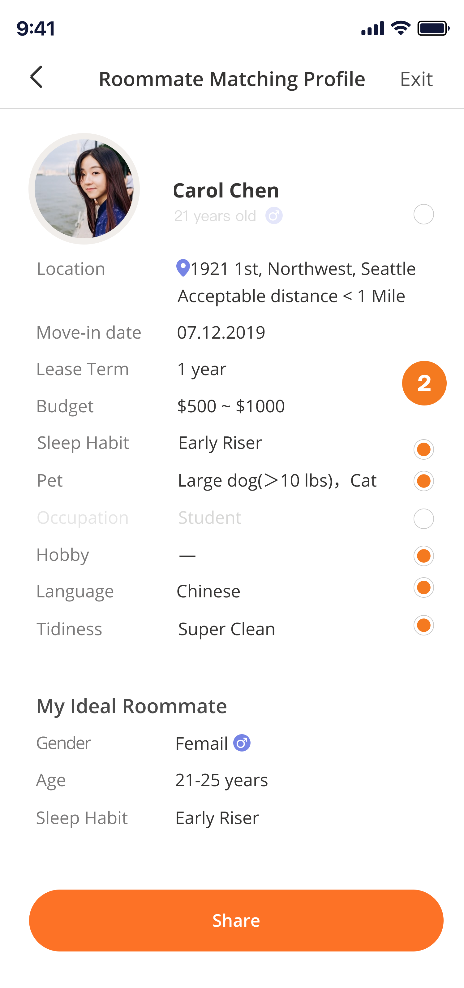
Let users lock information they don’t want to share with the public.


Reminder card after user seeing all Matches
User could edit information shared with public
What the profile looks like in public page
Solution: Create an interface not alike a dating app.
We swung between whether the interface should resemble dating apps or not during the process.
Since we are matching people, we naturally think about whether we could push further and make it more like a dating app( 1st round to 2nd round).
However In the test, user told us dating app-alike experiences for anything other than dating were “weird.” They feel that dating app interfaces come with a stigma outside of dating, which makes user feel “not that much reliable.”
So in the final solution, we took out matching score and be more focused on content itself instead of photo.


First Round
Big circle profile avatar
Second Round
Enlarged the profile picture
+ added a matching score
Third Round
Remove matching score
+ focused on content


Coming up with a design solution for a shipped product requires many trade-offs between business, technology, and various needs of different stakeholders. As a designer, instinct is a valuable gift. But it's also important to have sufficient rationales behind each trade-off we made.
One of the big things I learned from this project is having a carefully documented hand-off for the Dev team. It's fundamental if you want to make sure your design would be 100% implemented. Many interfaces and interactions might look straight-forward for designers but would be interpreted differently via Engineers.
Thanks for reading


